scatter_density_plot_matrix
- typhon.plots.scatter_density_plot_matrix(M=None, hist_kw={}, hexbin_kw={'cmap': 'viridis', 'mincnt': 1}, plot_dist_kw={'color': 'tan', 'linestyles': [':', '--', '-', '--', ':'], 'linewidth': 1.5, 'ptiles': [5, 25, 50, 75, 95]}, ranges={}, units=None, **kwargs)[source]
Plot a scatter density plot matrix
Like a scatter plot matrix but rather than every axes containing a scatter plot of M[i] vs. M[j], it contains a 2-D histogram along with the distribution as percentiles. The 2-D histogram is created using hexbin rather than hist2d, because hexagonal bins are a more appropriate. For example, see http://www.meccanismocomplesso.org/en/hexagonal-binning/
On top of the 2-D histogram, shows the distribution using func:plot_distribution_as_percentiles.
Plots regular 1-D histograms in the diagonals.
There are three ways to pass the data:
As a structured ndarray. This is the preferred way. The fieldnames will be used for the axes and order is preserved. Each field in the dtype must be scalar (0-d) and numerical.
As keyword arguments. All extra keyword arguments will be taken as variables. They must all be 1-D ndarrays of numerical dtype, and they must all have the same size. Order is preserve from Python 3.6 only.
As a regular 2-D numerical ndarray of shape [N × p]. In this case, the innermost dimension will be taken as the quantities to be plotted. There is no axes labelling.
- Parameters:
M (np.ndarray) – ndarray. If structured, the fieldnames will be used as the variables to be plotted against each other. Each field in the structured array shall be 0-dimensional and of a numerical dtype. If not structured, interpreted as 2-D array and the axes will be unlabelled. You should pass either this argument, or additional keyworad arguments (see below).
hist_kw (Mapping) – Keyword arguments to pass to hist for diagonals.
hexbin_kw (Mapping) – Keyword arguments to pass to each call of hexbin.
plot_dist_kw (Mapping) – Keyword arguments to pass to each call of func:plot_distribution_as_percentiles.
ranges (Mapping[str, Tuple[Real, Real]]) – For each field in M, can pass a range. If provided, this range will be passed on to hist and hexbin.
units (Mapping[str, str]) – Unit strings for each of the quantities. Optional. If not passed, no unit is shown in the graph, unless the quantities to be plotted are pint quantity objects.
If not passing M, you can instead pass keyword arguments referring to the different fields to be plotted. In this case, each keyword argument should be a 1-dimensional ndarray with a numeric dtype. If you use Python 3.6 or later, the order of the keyword arguments should be preserved.
- Returns:
- Figure object created.
You will still want to use subplots_adjust, suptitle, perhaps add a colourbar, and other things.
- Return type:
Examples:
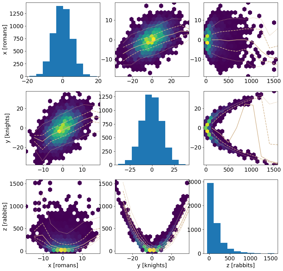
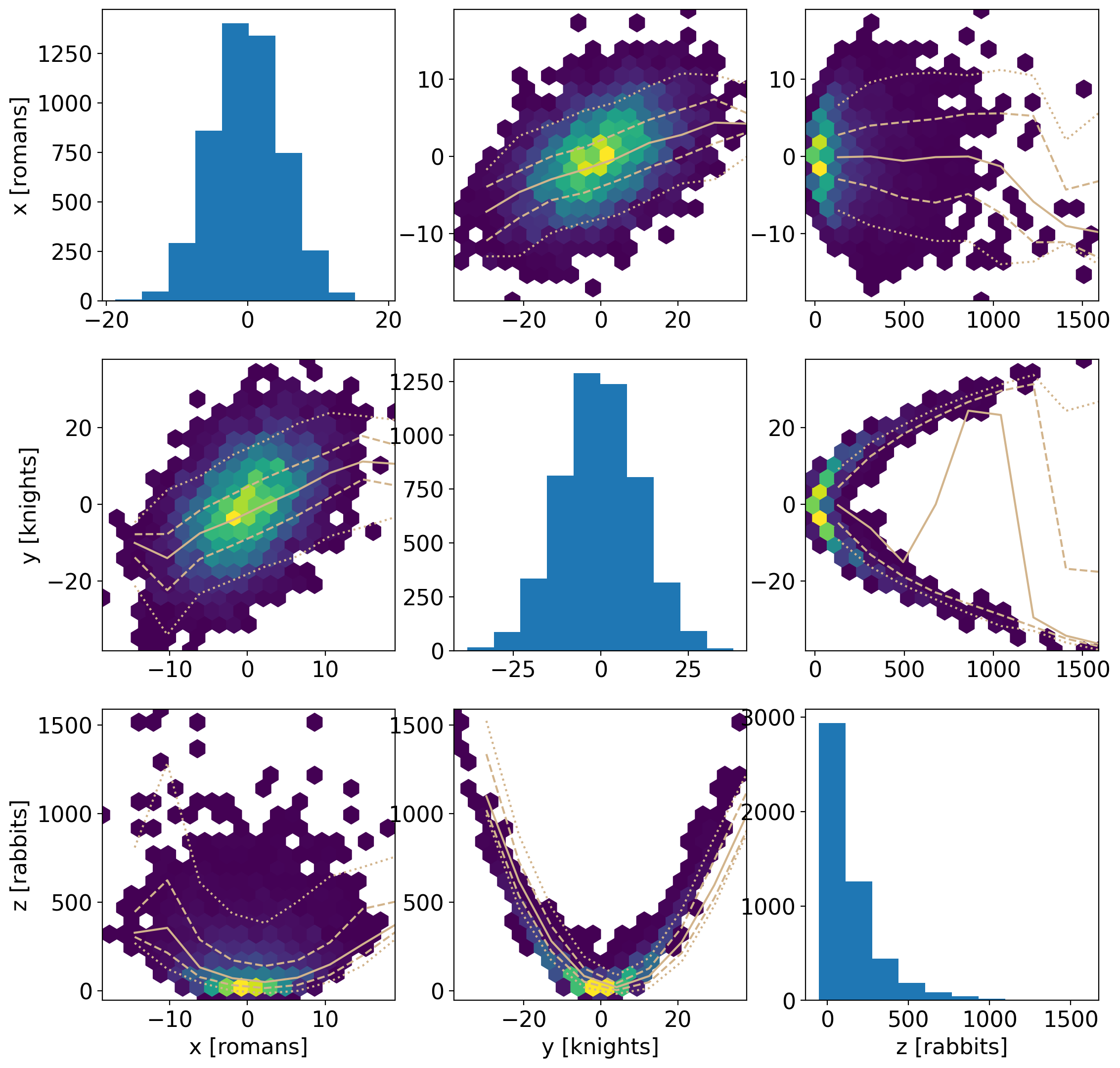
import numpy as np
import matplotlib.pyplot as plt
from typhon.plots import scatter_density_plot_matrix

x = 5*np.random.randn(5000)
y = x + 10*np.random.randn(x.size)
z = y**2 + x**2 + 20*np.random.randn(x.size)

scatter_density_plot_matrix(
    x=x, y=y, z=z,
    hexbin_kw={"mincnt": 1, "cmap": "viridis", "gridsize": 20},
    units=dict(x="romans", y="knights", z="rabbits"))

plt.show()
(
Source code,png,hires.png,pdf)
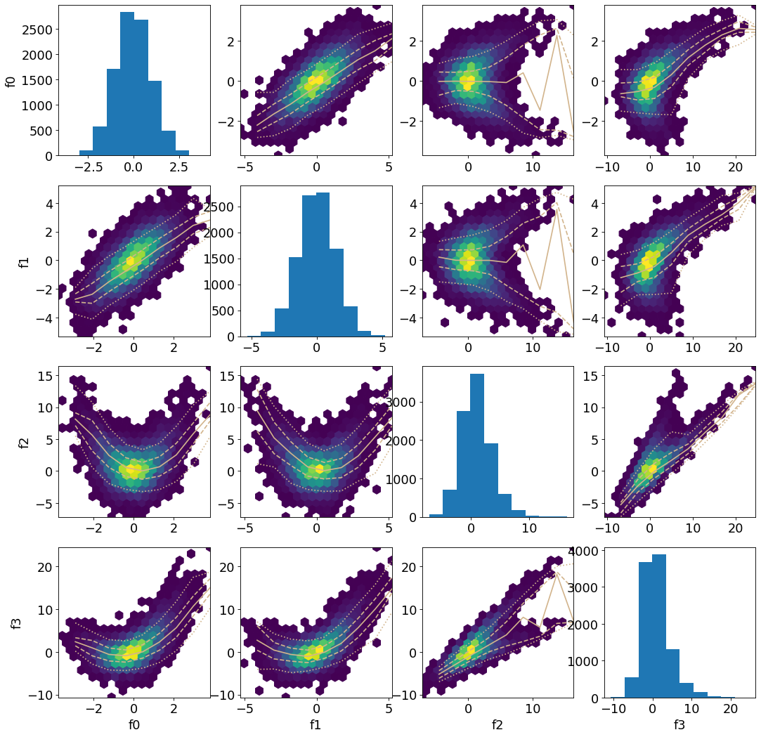
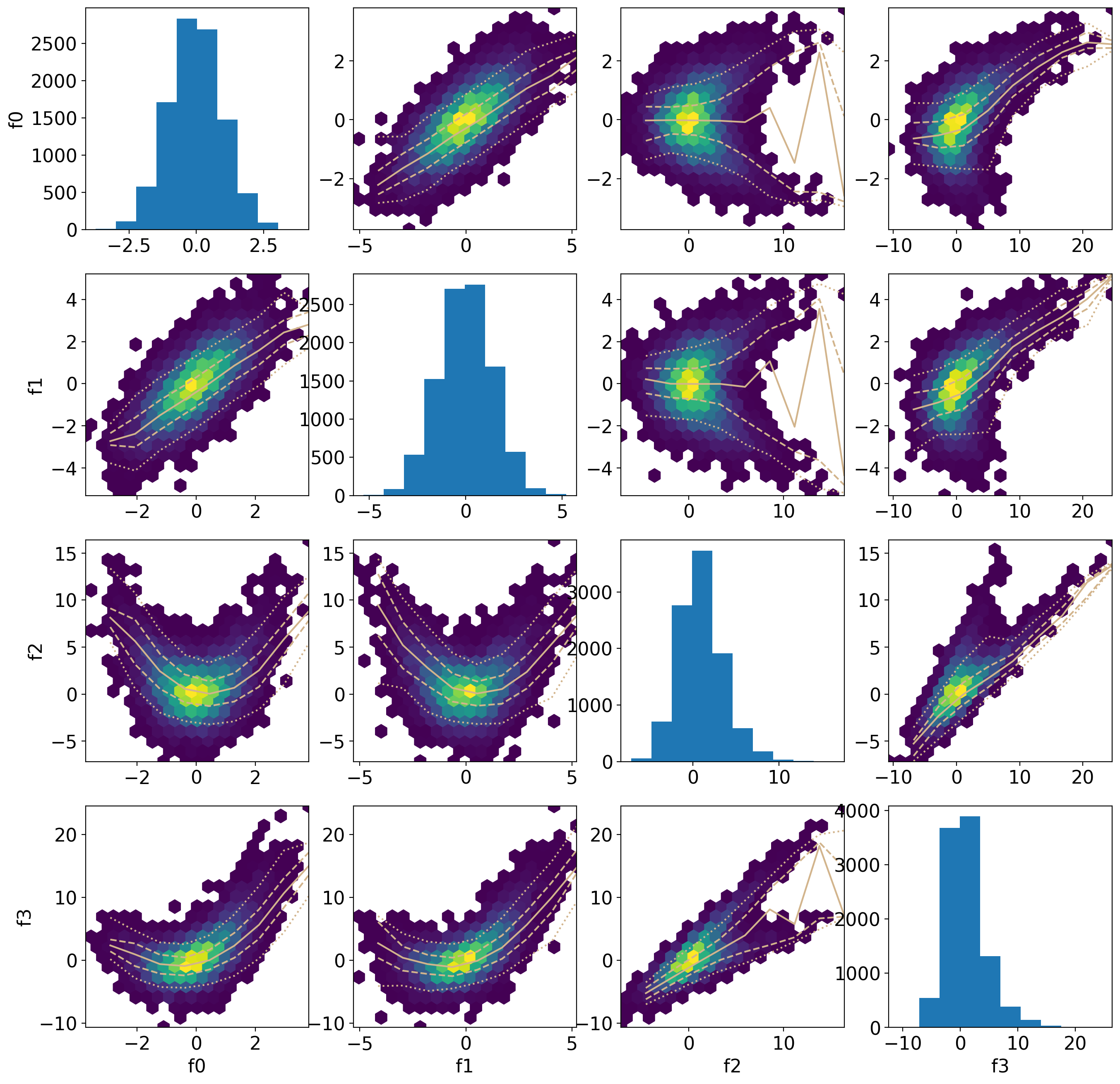
import numpy as np
import matplotlib.pyplot as plt
from typhon.plots import scatter_density_plot_matrix

M = np.zeros(shape=(10000,),
             dtype="f,f,f,f")
M["f0"] = np.random.randn(M.size)
M["f1"] = np.random.randn(M.size) + M["f0"]
M["f2"] = 2*np.random.randn(M.size) + M["f0"]*M["f1"]
M["f3"] = M["f0"] + M["f1"] + M["f2"] + 0.5*np.random.randn(M.size)

scatter_density_plot_matrix(M,
    hexbin_kw={"mincnt": 1, "cmap": "viridis", "gridsize": 20})

plt.show()
(
Source code,png,hires.png,pdf)